How I redesigned the whole product. Almost solo.
When I joined Threecolts I took ownership of an acquired product — built by its founder over 10 years. Technically solid. But activation was broken. The customers who got through the setup loved it and stayed for years. The problem was almost no one got there.
So I decided to focus on decreasing time-to-value and showcasing the aha-moment ASAP. However, our GTM was SLG, and let's say no one saw it as a priority.
To keep it short: I reverse-engineered successfully retained customers. And I worked my way up the ladder: setup -> aha moment -> activated (engagement threshold).
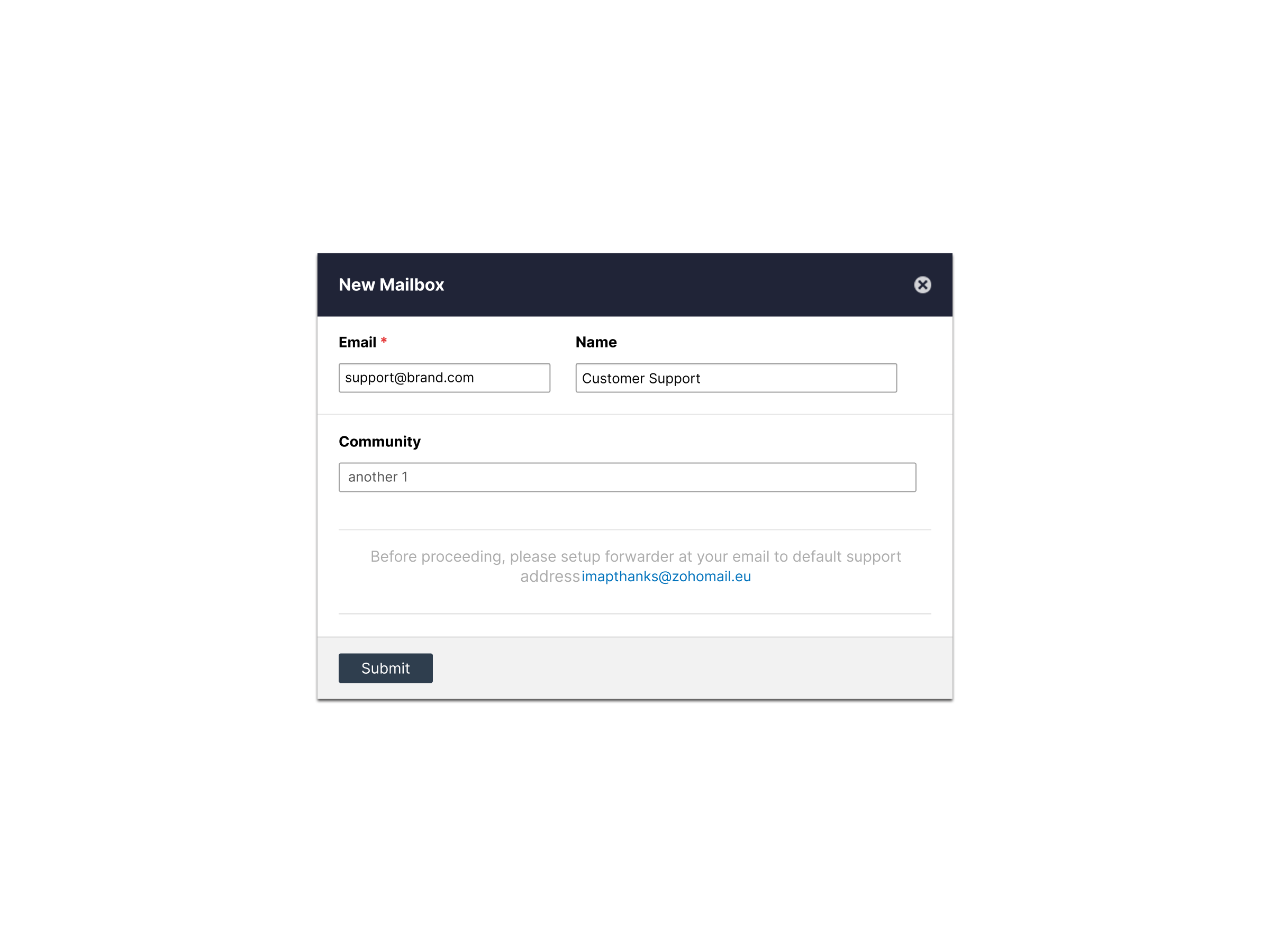
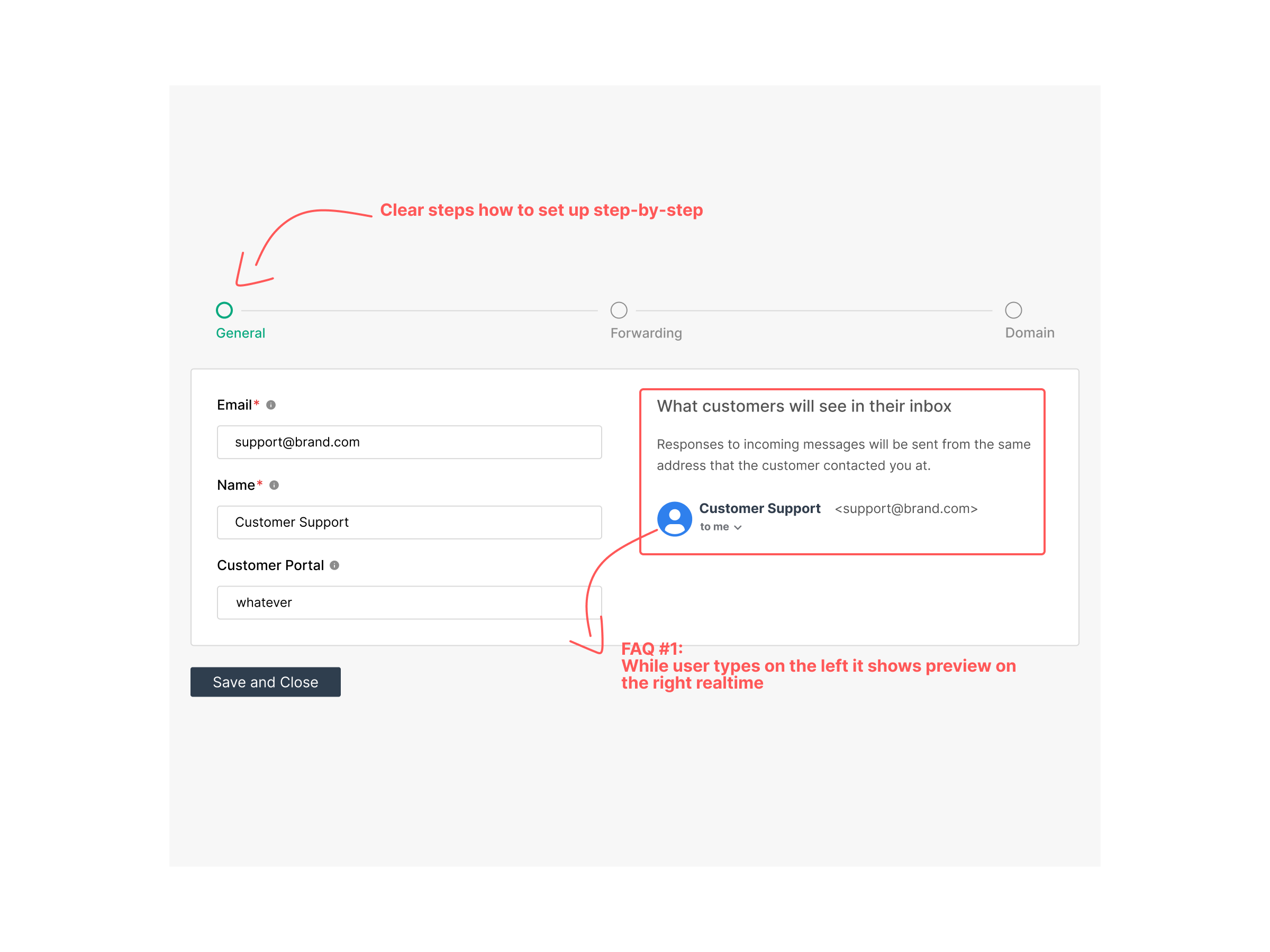
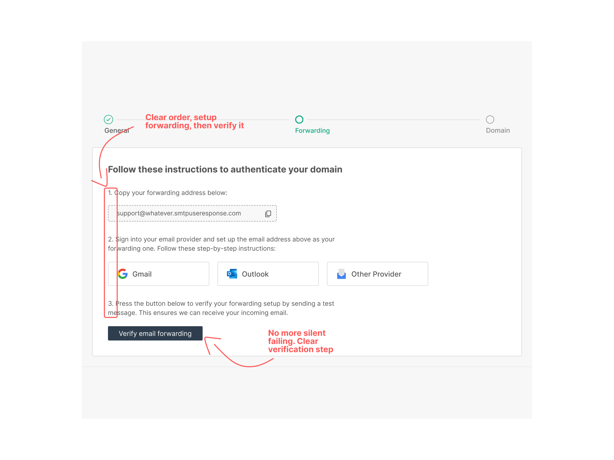
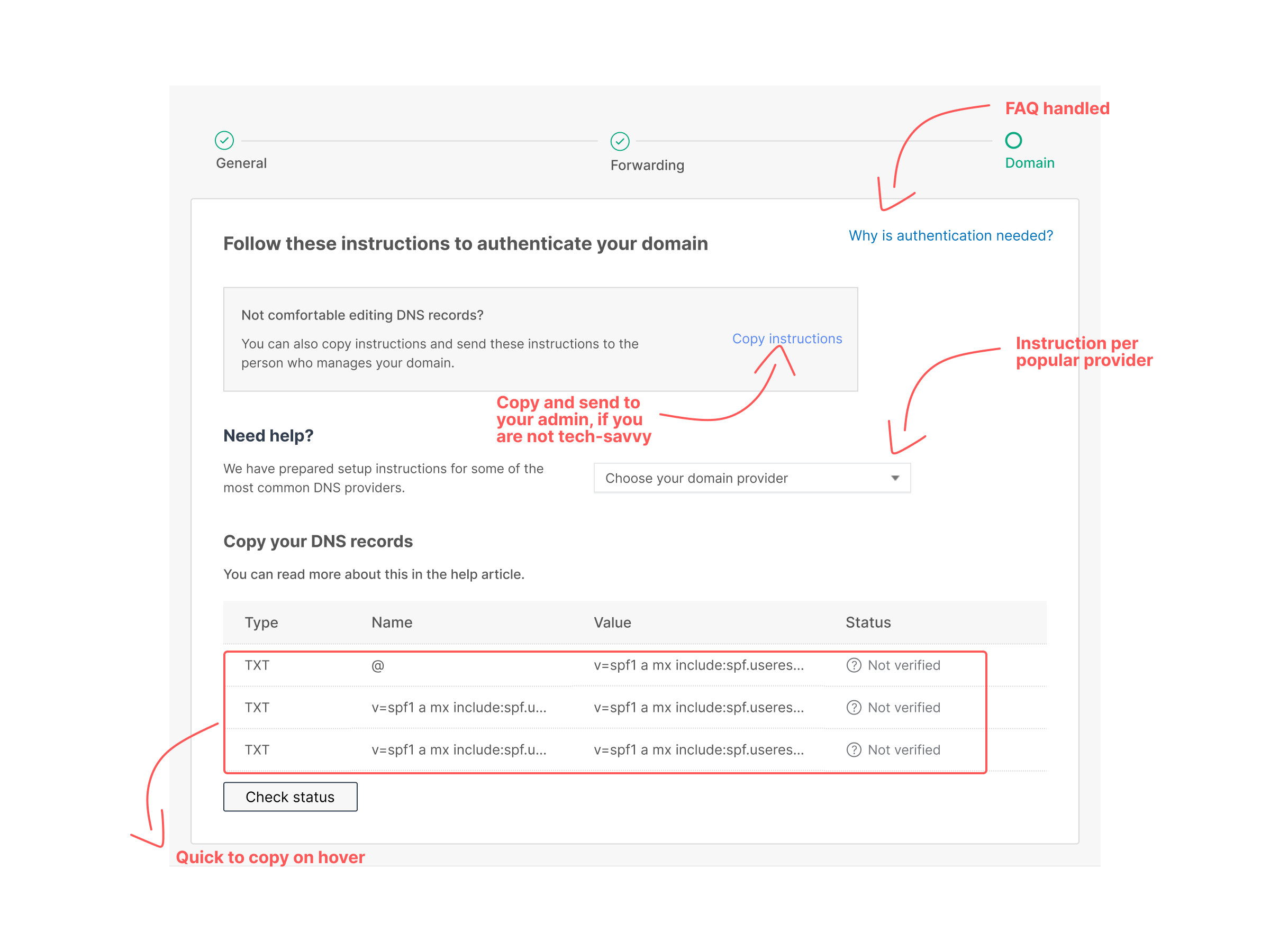
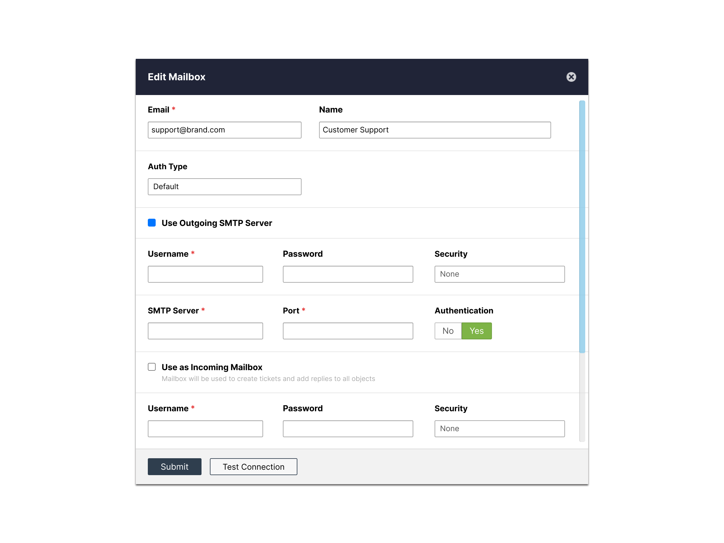
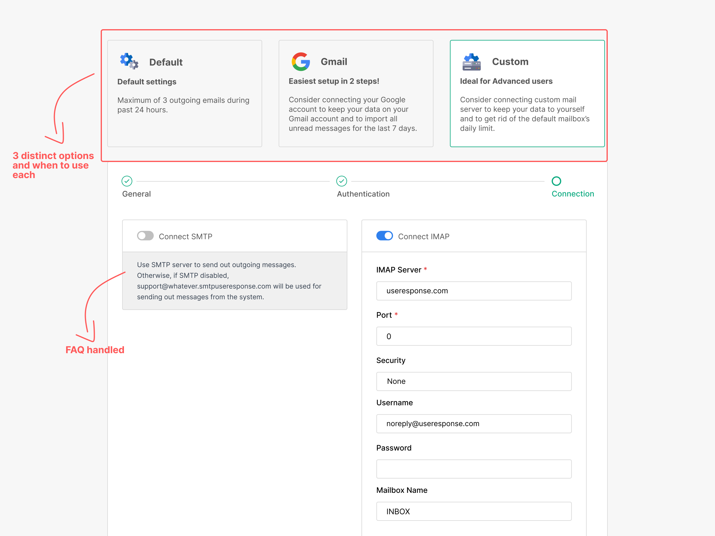
First I revamped Email setup. Talking about its screen UX issues is a rabbit hole.
It felt like an admin panel for the developer who built the feature. While the new design wasn't sexy, the interface perfectly answered all setup questions and the number of calls I joined dropped from five per week to zero.
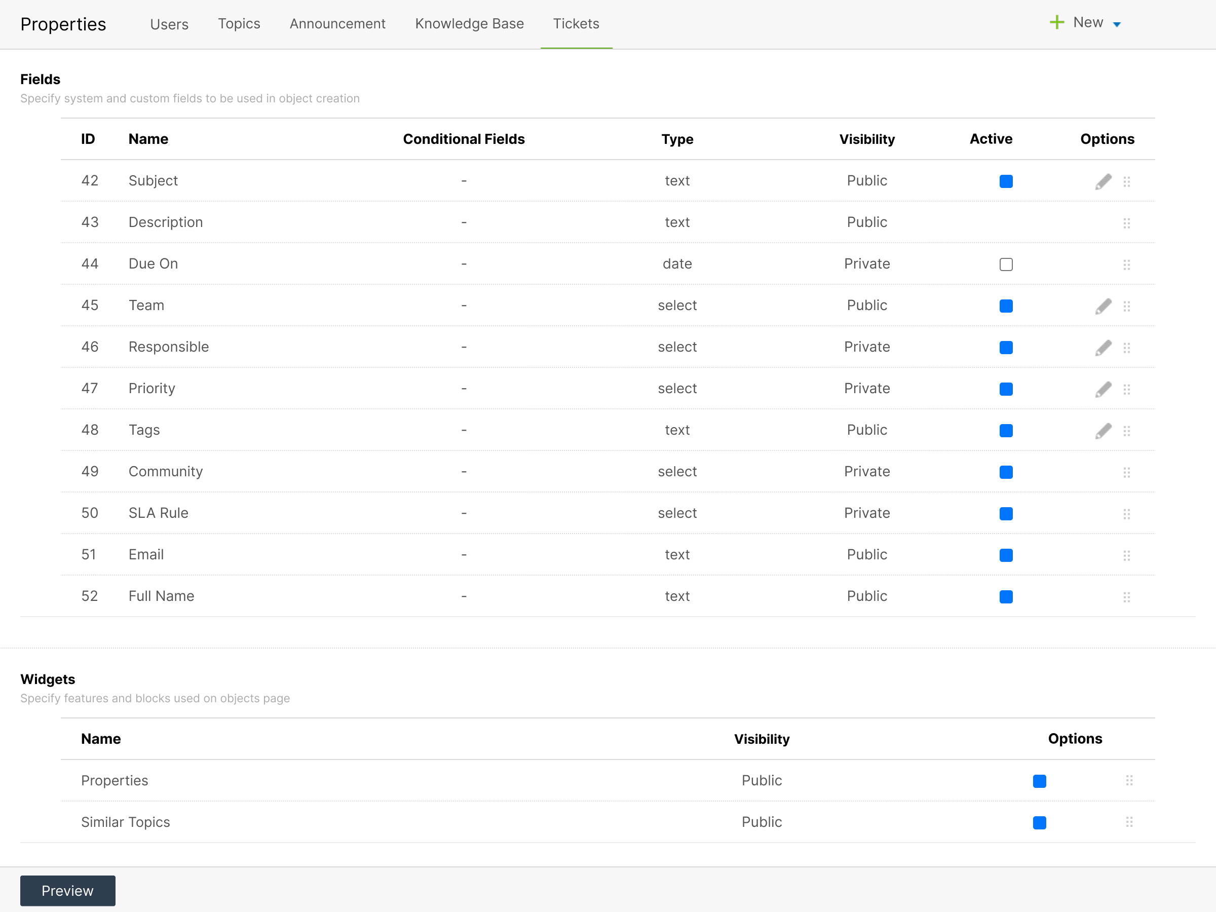
Second, I revamped the Contact form. As you can see, "before" gives no hint you're editing a contact form.
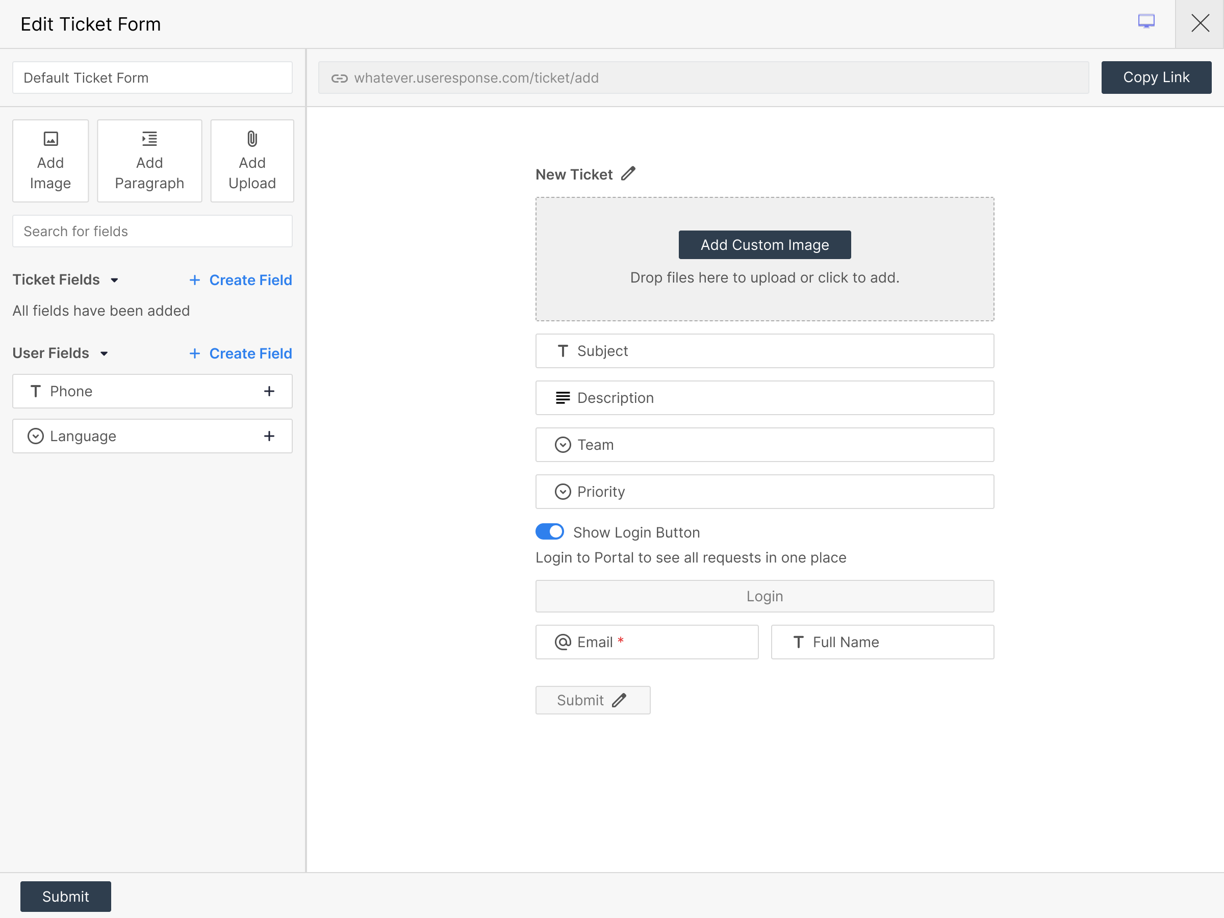
The setup moment was rescued. The next thing was the aha moment.
At that time I defined it as when the system starts doing the job instead of the user (before AI became a thing). So the goal became to make the invisible visible.
So I built an "object activity log" that surfaced every action the system took per object: assignments, status changes, email threads, rule triggers — all in one place.
Previously, to understand what was happening, users had to learn 4 separate things: the triggers log, the email log, the triggers setup, and the messages themselves.
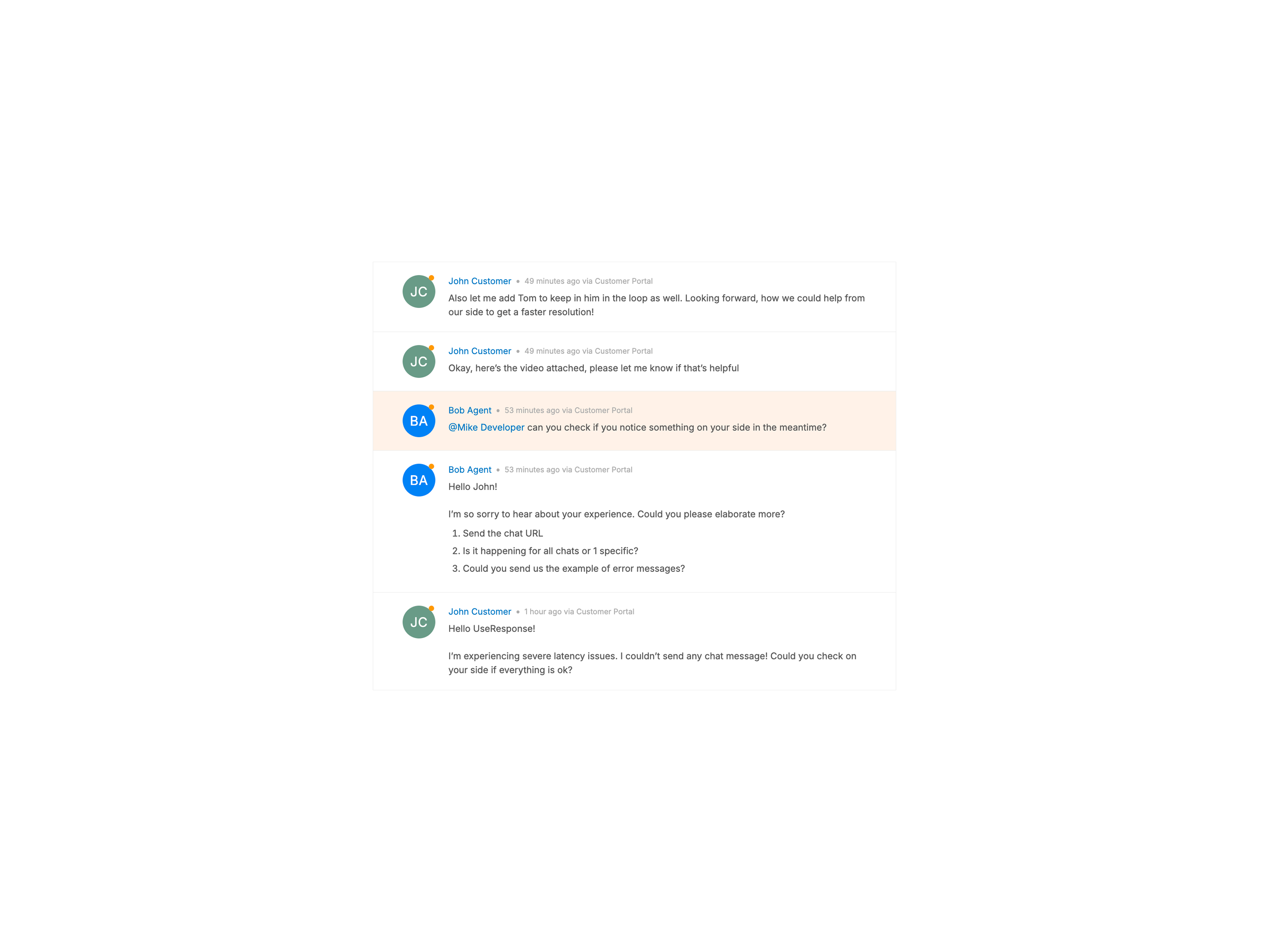
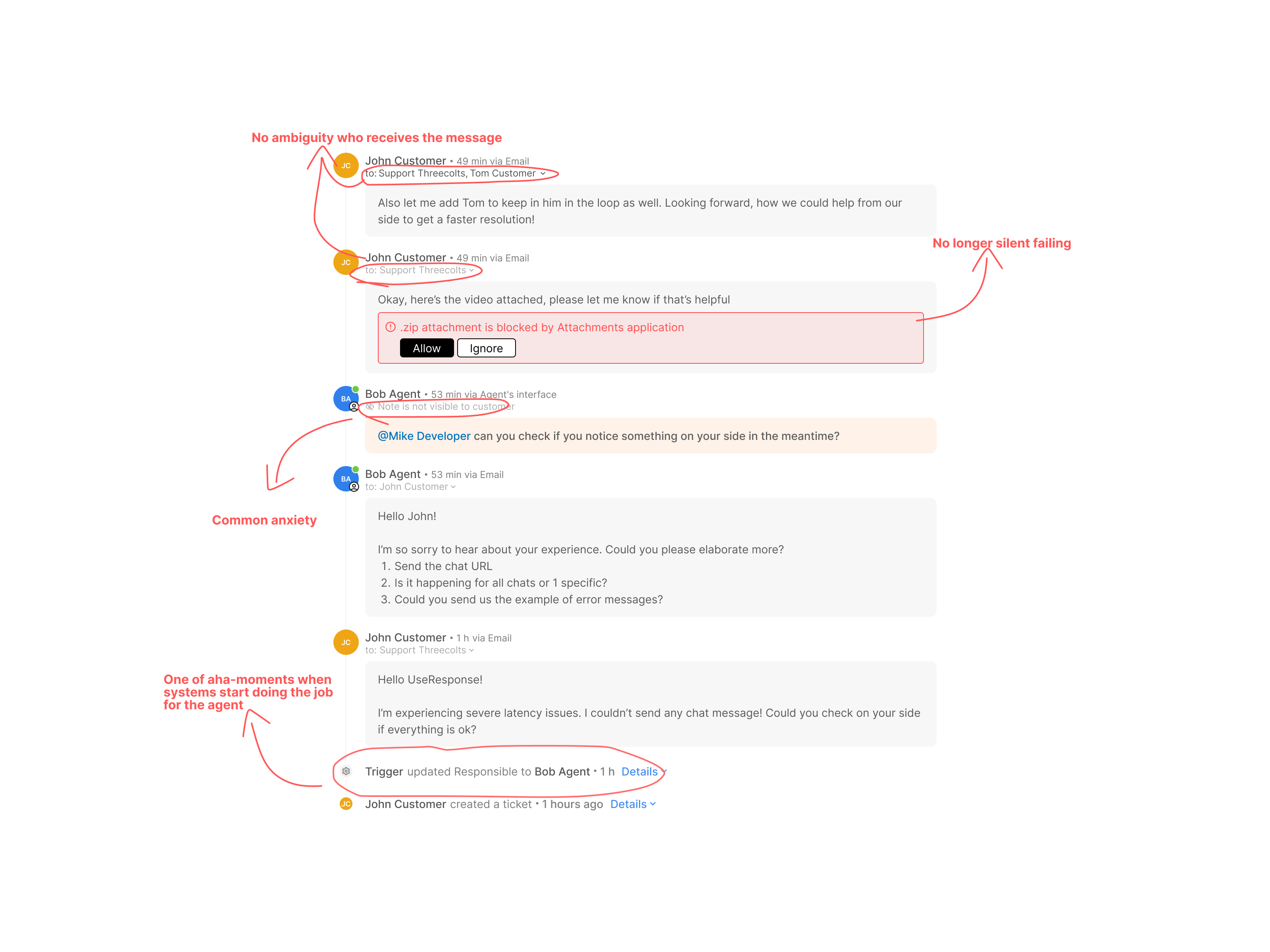
When existing customers saw it for the first time: "Wait, it does all that?" That awareness triggered the next question: "What else can it do?" Feature exploration jumped. Adoption followed.
Even though we consolidated everything in one place natively, we also got rid of the need for 2 popups: mailing log, change log.
Everything above shipped to production. This part stayed in Figma.
It's the most complex screen of the app — the working desk for support agents. You need to show the depth of the product (all features) without overwhelming users. E.g. it has a lot of hidden stuff like ready-to-invoke canned responses, all integrations are unified, data at hand and it can scale infinitely. The right sidebar itself would take another article to show its rabbit hole states. Same goes for search, left sidebar navigation, new email vs new ticket, etc.
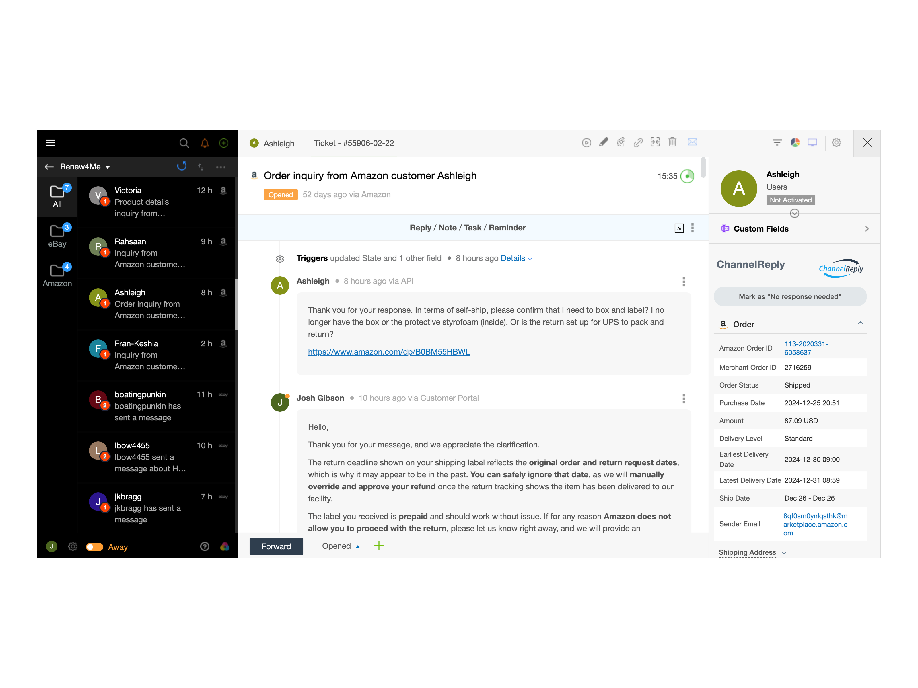
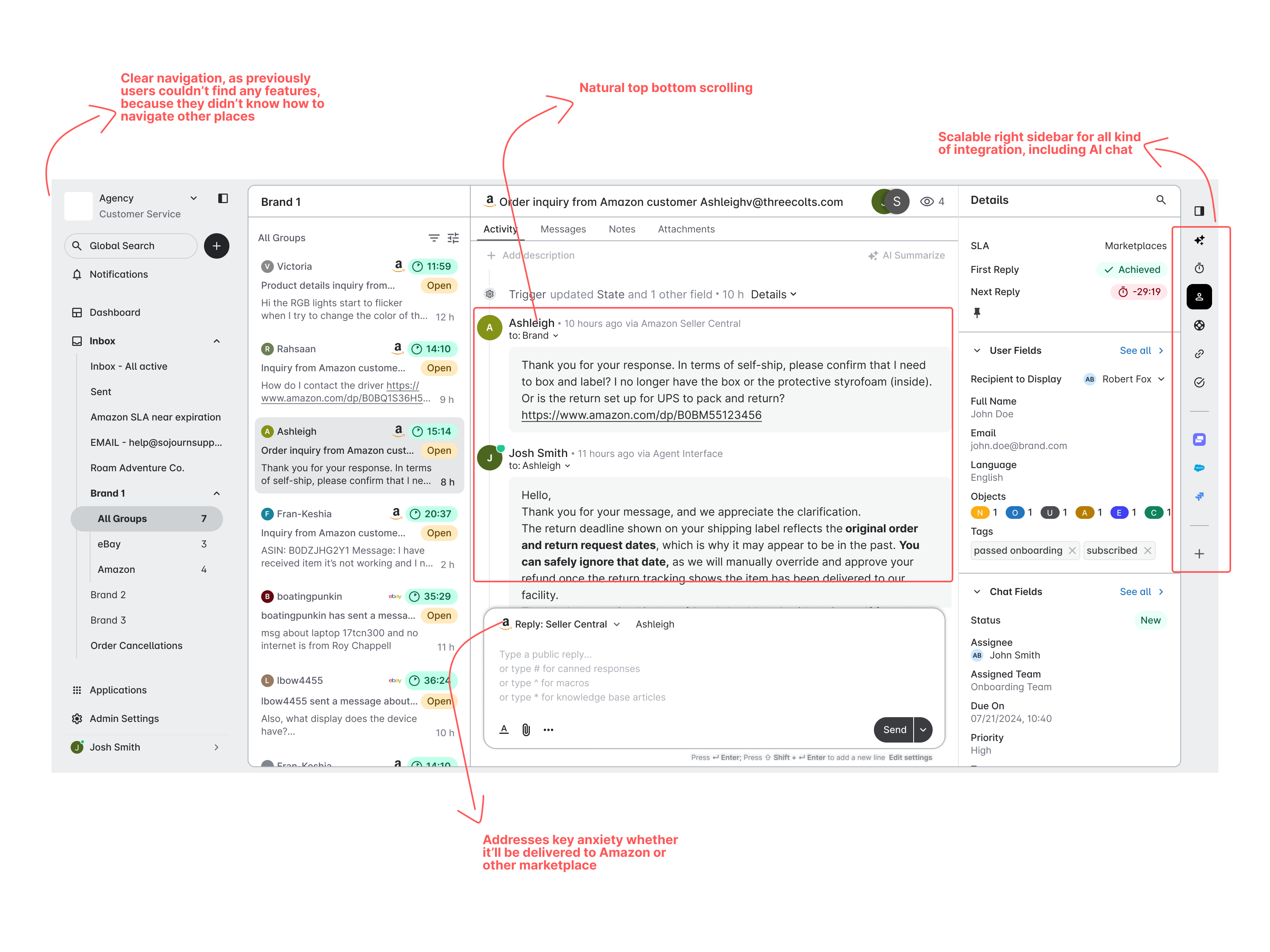
Drag to compare:
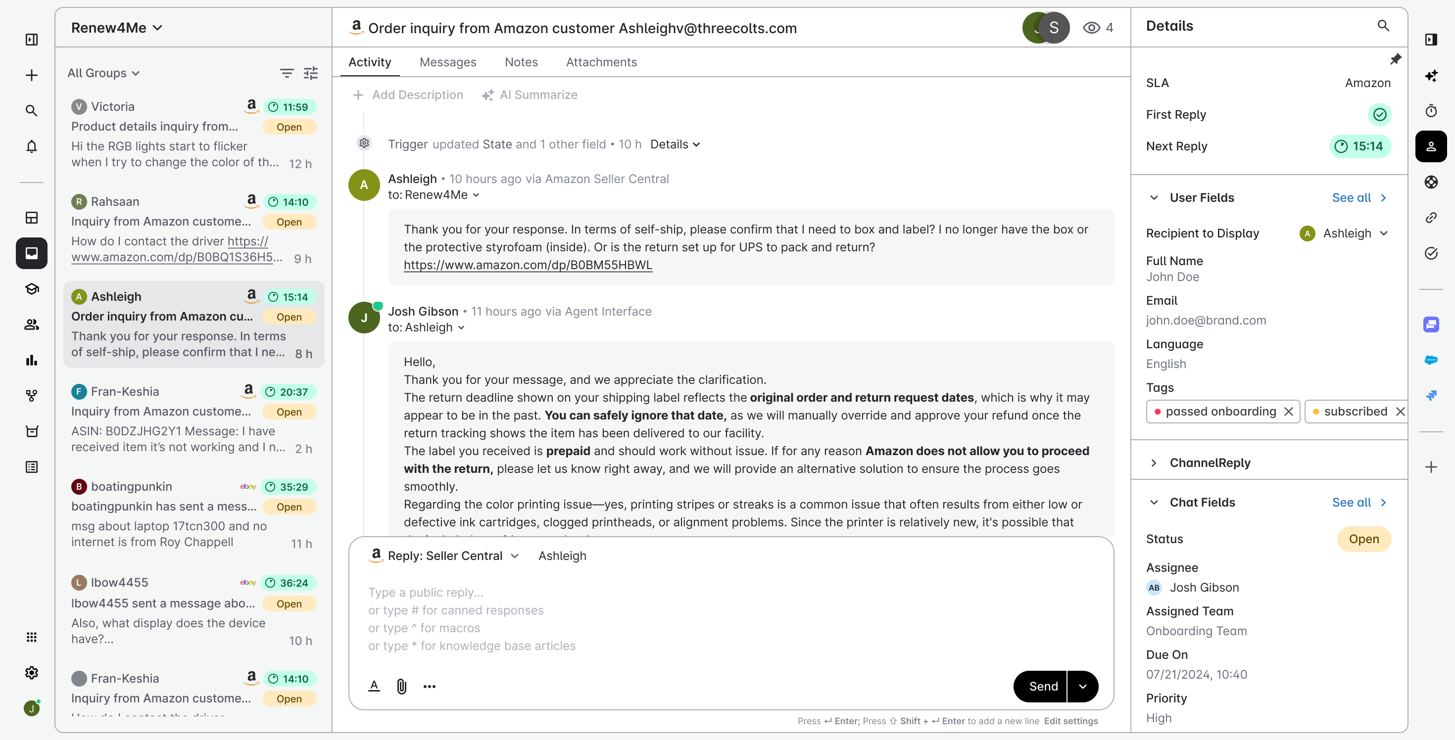
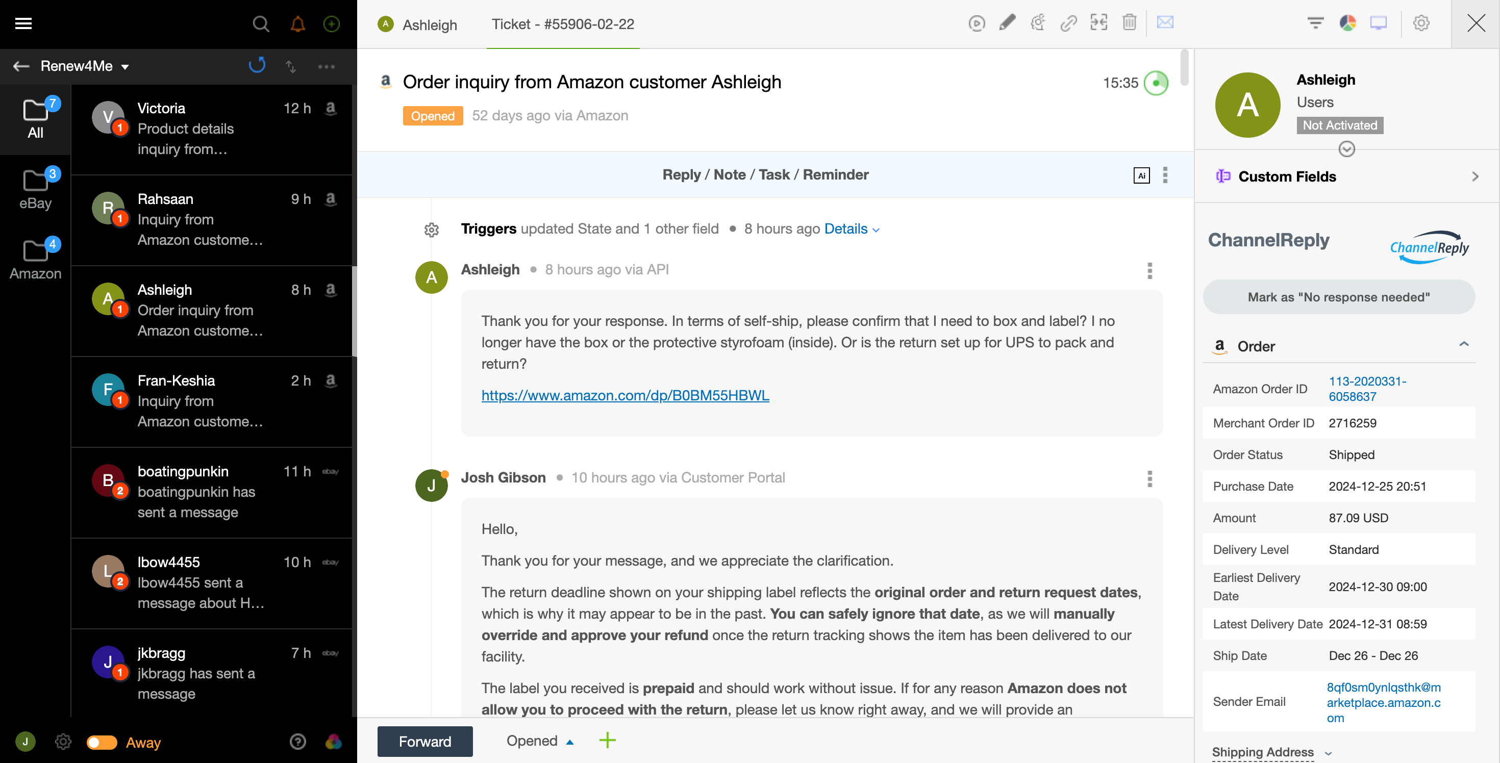
No single redesign had a KPI attached. The compound effect did: retention tripled within the first year.
Even though it became cleaner and customers wrote in caps lock how much they "LOOVE it", the UI was significantly constrained by the design system we had to work within. So don't judge the taste in absolutes.
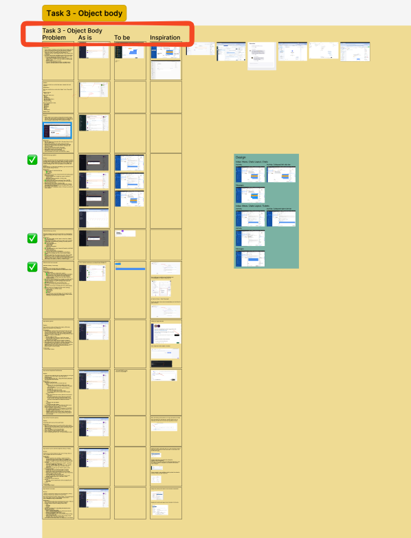
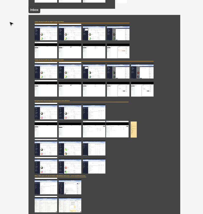
Nevertheless, I learned how to design and build design systems. Look at the design PRDs I was creating — I had dozens of files like this.
Couple of disclaimers:
- I didn't design before joining the team.
- We had no design system to start from.
- I worked with 3 designers and fired 1, because they didn't meet the standards. 1.5 years later a wonderful lady joined my team and taught me about design system nuances and design processes. Together we additionally redesigned the Triggers and Analytics pages.
- I'm proud of how I shipped "tabs" for the object view earlier than Slack.
- Our main competitor rolled out a similar design two years later — including the parts that never left my Figma. Pure global market validation. Worth mentioning: it took them ~10 PMs and 10 designers to reach the same quality bar.